“Luxury” gets thrown around a lot in wedding stationery marketing, often attached to nothing more than a higher price tag. But there’s a real, definable difference between an invitation that simply looks expensive in a product photo and one that actually feels luxurious the moment a guest holds it. That difference comes down to a specific set of design and material principles not a trend, but a framework that applies regardless of what’s popular this particular wedding season. Here’s what actually separates the two.
It’s Felt Before It’s Read
The single clearest signal of a luxury invitation is that the first impression happens through touch, not sight. A nice invitation photographs well. A genuinely luxury one feels different the instant it’s pulled out of the mailbox weight, texture, and rigidity all register before a guest has processed a single word of the design. This is precisely why heavyweight cardstock, velvet, and other tactile materials have become the foundation of high-end stationery rather than a decorative add-on: they’re doing work a flat, thin paper simply can’t.
Restraint, Not Density
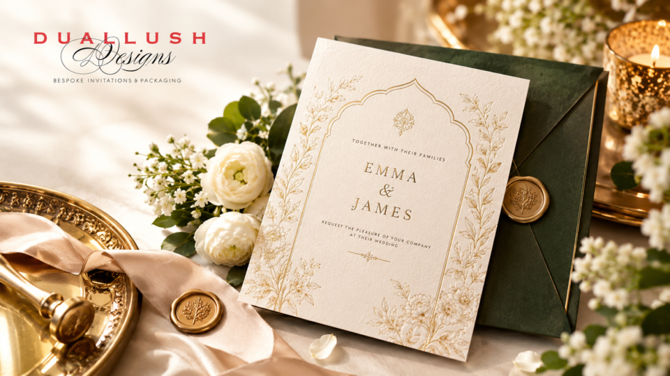
There’s a persistent myth that luxury means more more foil, more embellishment, more color. The opposite is closer to true. The strongest luxury invitations right now favor a single, well-executed detail one foil-stamped monogram, one deep letterpress line over a design covered in ornamentation. Restraint signals confidence: a couple who trusts one beautiful detail to carry the whole design, rather than needing to layer on decoration to prove the invitation is special.
This matters especially for American couples navigating a market saturated with template options restraint is one of the clearest visual signals that separates a genuinely custom piece from a semi-custom template dressed up with extra embellishment.
Material Quality Over Surface Decoration
Luxury increasingly lives in what the invitation is made of, not just what’s printed on it. A few material qualities consistently separate high-end stationery from standard cardstock:
- Weight and rigidity thicker stock simply feels more substantial in hand, and that heft is one of the fastest, most intuitive signals of quality a guest registers
- Texture a linen finish, a fabric wrap, or handmade paper’s slightly irregular surface all add a dimension flat, smooth cardstock doesn’t have
- Finish contrast pairing a matte, tactile base material with a high-shine foil or gloss detail creates visual and physical depth that a single-finish design can’t replicate
This is exactly why acrylic has become such a dominant luxury material in recent years its rigidity and reflective quality are, in a sense, the material doing the same job foil traditionally did, just built into the base itself rather than applied on top.
Layering and Structure
A single flat card, no matter how well designed, reads as informational. Genuine luxury suites are increasingly built as layered systems a base card, an overlay, a ribbon or belly band holding everything together creating a sense of depth and sequence rather than delivering all the information at once. This is the same principle behind the rise of folio invitations and boxed presentations: luxury is as much about the sequence of discovering the suite as it is about any single piece within it.
Finishing Techniques That Reward Closer Inspection
Foil stamping, blind embossing, and letterpress all share something in common: they reward a guest who looks closely, rather than relying on bold visual impact from across a room. A blind-embossed detail raised texture with no ink at all is often the most luxurious choice on an invitation precisely because it’s subtle enough that discovering it feels like a small, personal reward rather than an obvious design flourish.
Cohesion Across the Full Suite
A single beautiful invitation loses much of its impact if the RSVP card, details card, and envelope liner feel like they came from somewhere else entirely. Genuine luxury stationery treats every piece down to the return address printing as part of one considered system, extending the same material, color, and typographic choices consistently across the full suite. This consistency is part of why ordering a complete suite from a single studio, rather than piecing components together from different sources, tends to produce a noticeably more cohesive result.
Presentation as Part of the Experience
How an invitation arrives matters almost as much as what it says. A suite delivered in a well-constructed invitation box rather than loose inside a standard envelope creates a small ceremonial moment before a guest even reads the details, turning the invitation from a piece of mail into something closer to a gift.
Personalization That Feels Specific, Not Generic
A monogram, a venue-inspired motif, or a die-cut shape tied to the wedding’s theme signals that the invitation was built for this couple specifically, not pulled from a shared template library. This is one of the clearest, fastest ways American couples can differentiate a genuinely custom suite from the sea of similar-looking semi-custom options widely available online.
The Common Thread
Every element on this list points back to the same underlying principle: luxury is what a guest experiences, not what a couple spends. A thick, well-chosen material with one confident detail will always read as more luxurious than an ornate design on thin paper regardless of which one actually cost more to produce. If you’re evaluating your own invitation choices, the most useful question isn’t “does this look expensive in the mockup” but “what will this actually feel like in someone’s hands.”
Want help translating these principles into a suite that fits your specific wedding?
Get a free design consultation with our team, and we’ll help you choose the materials, finishes, and structure that create a genuinely luxury feel not just a luxury price tag.