Once you’ve decided acrylic is the right material for your wedding invitations, there’s a second decision waiting right behind it: clear or frosted? The two finishes come from the same material family, but they create genuinely different visual effects, suit different wedding styles, and even come with different practical considerations for printing and readability. Here’s how to choose between them.
The Core Difference
Clear acrylic is fully transparent light passes straight through it, and the design appears to float in mid-air with nothing behind it. It’s the more dramatic, architectural of the two finishes, and it puts the entire visual weight of the invitation on typography and layout, since there’s no surface texture to soften the look.
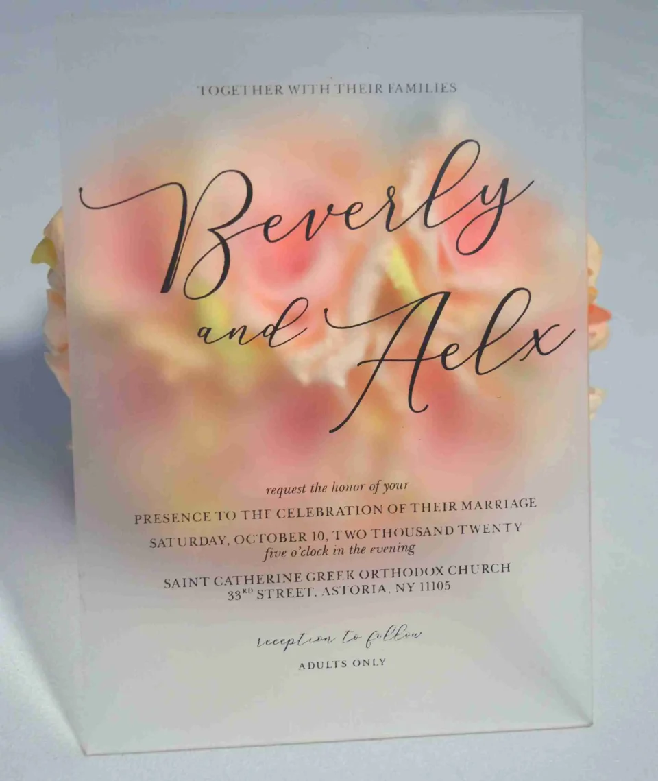
Frosted acrylic is semi-opaque, with a hazy, diffused quality that scatters light rather than transmitting it directly. That subtle haze gives frosted invitations a softer, more delicate appearance closer to etched glass than a clear window.
Neither is objectively “better.” They’re built to create different moods, and the right choice depends almost entirely on your wedding’s overall aesthetic.
Visual Mood: Sharp and Modern vs. Soft and Romantic
Clear acrylic reads as sleek, contemporary, and unapologetically modern. Because there’s no diffusion, colors and metallic inks appear crisp and high-contrast, and the card itself takes on an almost sculptural, gallery-like quality. It’s the natural choice for editorial, minimalist, or architecturally-styled weddings, where clean lines are already the design language of the day.
Frosted acrylic softens that same modern material into something more romantic. The diffused, slightly hazy surface gives it an ethereal quality that pairs particularly well with garden weddings, boho styling, or European-inspired romantic aesthetics occasions where you want acrylic’s durability and contemporary edge without the starker, more architectural feel of a fully transparent card.
Readability and Practical Differences
This is where the two finishes genuinely diverge beyond aesthetics.
Clear acrylic requires careful thought about background. Because there’s nothing behind the printed text, dark or low-contrast ink can be difficult to read depending on what surface the invitation is resting against. White, metallic, or light-colored ink is the standard approach, and many designers pair clear panels with a solid-color envelope liner or backer card to make the text stand out reliably.
Frosted acrylic solves that readability question more naturally. The semi-opaque surface itself acts as a built-in background, giving printed or engraved text more consistent contrast regardless of lighting conditions or what the card is set against. This is also why frosted panels tend to photograph and read well even on overcast days or in dimmer indoor lighting, where a fully clear card can look flat by comparison.
Printing and Engraving Considerations
Both finishes work with UV printing and laser engraving, but the visual effect of each technique shows up differently depending on the finish:
- On clear acrylic, engraved or etched text creates strong contrast between the transparent and frosted-by-engraving areas, giving even simple typographic designs a sense of depth and dimension.
- On frosted acrylic, the existing diffusion means engraving reads slightly softer, blending more naturally into the surface rather than standing in sharp contrast a subtler effect that suits understated, elegant designs particularly well.
- Colorful, photographic, or highly detailed designs generally show up more vividly on clear acrylic, since there’s no haze softening the image, while frosted acrylic tends to favor simpler typographic or monogram-style layouts.
Which One Fits Your Wedding?
| Your Wedding Style | Better Fit |
|---|---|
| Modern, minimalist, editorial | Clear |
| Garden, boho, romantic European | Frosted |
| Black-tie, architectural, gallery-style | Clear |
| Soft, ethereal, outdoor celebration | Frosted |
| Bold color or photographic design | Clear |
| Simple monogram or typographic design | Frosted |
| Concerned about readability in varied lighting | Frosted |
Cost and Weight: Roughly the Same
Clear and frosted panels are generally priced similarly, since the cost difference comes primarily from thickness, printing method, and finishing detail rather than the transparency level itself. Both are noticeably heavier than paper, which can affect postage, and both benefit from a slightly thicker gauge if you’re mailing rather than hand-delivering, since thinner sheets are more prone to chipping in transit.
A Middle-Ground Option Worth Knowing
If you genuinely can’t decide, some couples combine both finishes within a single suite: a clear acrylic main invitation paired with a frosted RSVP or details card, or vice versa. This gives you visual variety across the suite while keeping the overall material consistent, rather than mixing acrylic with an entirely different material for contrast. It’s also worth remembering that acrylic itself is one of two dominant luxury invitation directions this year if neither clear nor frosted quite matches your wedding’s tone, a velvet invitation might be the better material fit entirely, particularly for more traditional or romantic celebrations that skew tactile over architectural.
The Bottom Line
The choice between clear and frosted acrylic really comes down to one question: do you want your invitation to feel sharp and architectural, or soft and diffused? Once you know the answer to that, the rest of the decision ink color, engraving style, and pairing with other suite pieces tends to follow naturally.
Still deciding between clear and frosted?
Order a sample of both finishes side by side, or get a free design consultation with our team to find the exact acrylic style that matches your wedding’s vision.