Of all the acrylic finishes trending in luxury wedding stationery right now frosted, mirror, colored it’s the fully clear, glass-like version that’s generating the most conversation. There’s something almost counterintuitive about it: an invitation you can see straight through is, somehow, one of the most memorable formats a guest can receive. Here’s why transparency specifically has become such a defining choice for 2026 weddings, and how to use it well.
The Appeal of “Nothing There”
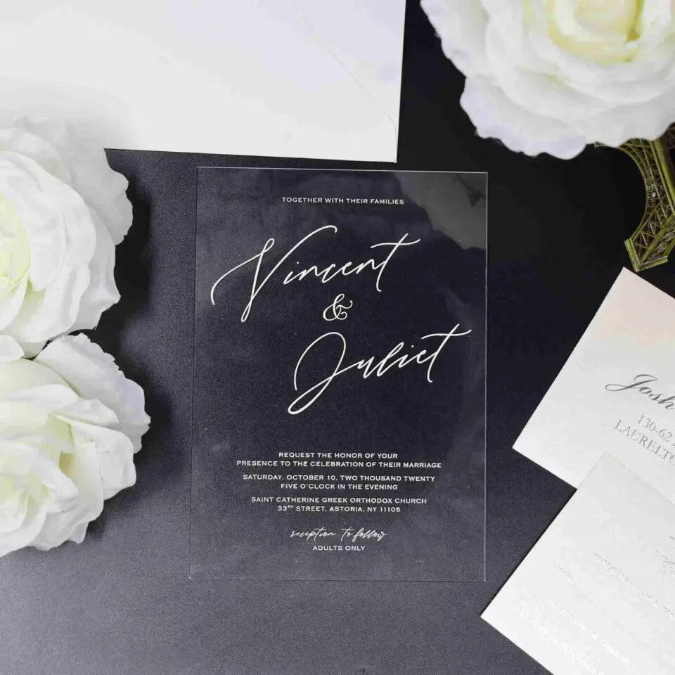
Every other invitation material works by adding something color, texture, pattern to communicate luxury. Clear acrylic works by removing it. There’s no background to look at, no cardstock color to choose; the words themselves, printed or laser-etched directly onto transparent material, become the entire visual event. That absence is exactly what makes it feel so different from anything else in a guest’s mailbox it reads less like a printed card and more like a small piece of glass artwork.
This is why clear acrylic tends to get described in almost sculptural terms by couples and stationers alike it behaves more like a keepsake object than a document, and it’s part of why so many guests choose to display it rather than file it away.
Why 2026 Specifically
A few forces are converging to push transparent invitations further into the mainstream this year rather than keeping them a niche specialty item:
It’s the purest expression of “quiet luxury.” As restrained, uncluttered design has taken over from the more decorated stationery of a few years ago, nothing communicates minimalism more directly than an invitation with literally no background at all. Clear acrylic doesn’t need embellishment to look expensive the material itself does the work.
It photographs unlike anything else. Because the card is transparent, it interacts with whatever surface it’s placed on a marble countertop, a linen tablecloth, natural light streaming through a window in a way flat cardstock simply can’t. Couples building out wedding content for social media have taken notice, since a clear acrylic flat-lay produces a genuinely different image every time depending on styling.
It’s become a design category of its own, not just an acrylic sub-type. Where clear acrylic used to be one option within the broader acrylic category, 2026 trend coverage increasingly treats it as its own distinct aesthetic a genuine “transparency” movement alongside frosted vellum and other translucent materials, rather than simply the plainest acrylic finish.
The Practical Side: What Makes Transparent Invitations Actually Work
Clear acrylic’s biggest strength no background is also its biggest design challenge. Text needs to be genuinely legible without anything behind it, which means a few practical choices matter more here than with any other material:
White or light ink is essential, not optional. Dark ink on clear acrylic is difficult to read from most angles, so white, cream, or metallic foil lettering is the standard, high-contrast approach.
A backer card or envelope liner solves the readability question. Pairing a fully clear card with a solid-color envelope liner or an inserted paper backing behind it gives guests a defined surface to read against, while still preserving the “see-through” effect the moment the invitation is lifted out. This single styling choice is often the difference between a clear invitation that reads as elegant versus one that reads as difficult to actually use.
Laser-etched or engraved text adds dimension that flat printing can’t. Rather than ink sitting on the surface, etched lettering catches light differently depending on the angle, giving even a minimal design a subtle sense of depth and craftsmanship.
Styling Ideas for a Clear Acrylic Suite
- Pair with a jewel-toned or black envelope for maximum contrast the transparent card becomes a striking visual moment the second it’s slid out.
- Add a single laser-cut motif a monogram, a small botanical silhouette, a geometric shape rather than a full illustration, keeping the minimalist effect intact while still adding a personal touch.
- Nest inside a velvet invitation box for a striking material contrast: the plush, opaque exterior gives way to a sleek, see-through card underneath, combining two very different sensory experiences in one unboxing.
- Coordinate with a matching acrylic RSVP or details card rather than switching to standard cardstock partway through the suite, so the transparent effect carries consistently across every piece.
What to Plan For Before Choosing Clear Acrylic
Production time. Clear acrylic requires custom laser-cutting and etching rather than standard printing, which typically means an 8- to 10-week production window rather than the 4 to 6 weeks a paper suite needs. Build that into your planning timeline early, particularly if you’re also managing save the date cards or other stationery on a tighter schedule.
Shipping weight and protection. Acrylic is heavier and more rigid than paper, which can increase postage cost and requires more careful packaging to prevent chipping in transit thicker gauges hold up better than thin ones if your suite is being mailed rather than hand-delivered.
Seeing it in person first. More than almost any other material, clear acrylic looks genuinely different in photos versus in hand lighting, reflections, and the surface it’s resting on all change the effect dramatically. Ordering a sample before committing to your full print run is the only reliable way to judge how the transparency and ink contrast will actually read.
Is Clear the Right Choice for Your Wedding?
Clear acrylic is a genuinely bold, minimalist statement, and it suits weddings that are already leaning modern, architectural, or gallery-inspired far better than it suits a romantic or traditional celebration. If your wedding’s visual language is built around clean lines and restraint, transparent invitations aren’t just on-trend they’re a natural extension of the aesthetic you’re already creating everywhere else.
Curious whether clear acrylic fits your wedding’s style?
Get a free design consultation with our team, and we’ll help you figure out the ink, pairing, and presentation that make a transparent suite feel intentional rather than just trendy.