
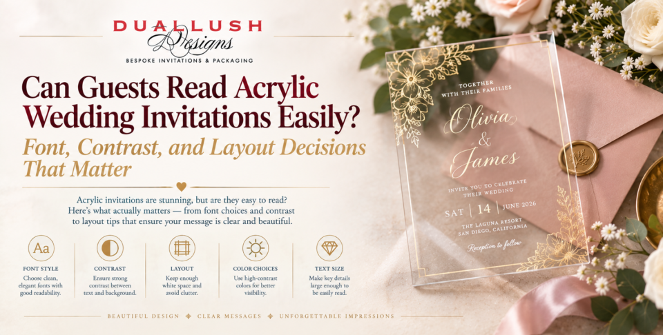
Acrylic invitations look stunning in photos. The question couples and planners ask next is a practical one: can your guests actually read them? It’s a fair worry. A card that looks elegant on a styled flat-lay but forces a guest to tilt it toward a window to find the start time has missed its main job.
The good news is that acrylic can be very easy to read. But legibility on acrylic isn’t automatic, and it depends on three decisions you make before anything is printed: the typeface, the contrast, and the layout. Here’s how to get each one right.
Why Acrylic Behaves Differently From Paper
On paper, the page itself provides the background. Black ink on white stock is readable almost anywhere. On acrylic, the background is whatever happens to sit behind the card, whether that’s a countertop, an envelope liner, or a patterned tablecloth. That’s especially true of clear acrylic, where the surface behind the card remains visible through the lettering.
This is why a design can look crisp against the plain white background of a product photo and lose contrast over a busy surface. Frosted acrylic softens this problem because the translucent surface acts as a built-in background, but it doesn’t remove it entirely. Whatever finish you choose, plan for how it will really be viewed, not how it looks in the mockup.
Decision 1: Contrast
Contrast is the single biggest factor in whether an acrylic invitation reads comfortably.
Choose ink for the card, not the photo. On clear acrylic, white ink and metallic foil are the standard choices because they stand out against the varied surfaces behind the card. Dark ink on clear acrylic can be difficult to read from some angles and over some backgrounds, so it’s usually best reserved for frosted or backed pieces.
Give the card something to sit against. A backer card or envelope liner in a solid color gives guests a defined surface behind the lettering, which lifts contrast dramatically while keeping the see-through effect when the card is lifted out. A solid, uncluttered liner almost always works better than a patterned one.
Be careful with low-contrast pairings. Pale metallic on a light surface, or a soft pastel ink on frosted acrylic, can look gorgeous in a mockup and disappear in real lighting. If a color combination makes you squint at your own sample, your guests will squint too.
Think about lighting. An invitation read on a bright kitchen counter looks different from one read in a dim hallway. Texture and shine on acrylic can also create glare. Test your sample in more than one kind of light before approving it.
Decision 2: Typeface
Acrylic is unforgiving of delicate lettering, because there’s no paper fiber to hold and soften thin strokes.
Favor strong, even letterforms. Fonts with moderate stroke contrast and a clear structure read best, especially for details like dates, times, and addresses. Hairline strokes can thin out and nearly vanish at smaller sizes, particularly in white ink or foil.
Use script carefully. A flowing script can be beautiful for names, but it’s often the first place legibility breaks down, especially at small sizes or with very decorative flourishes. If you love a script, reserve it for the couple’s names at a generous size and set everything else in a simpler face.
Pair two fonts, not three. A common and reliable approach is one expressive font for the names and one clean serif or sans-serif for supporting text. The contrast between them guides the eye and keeps the practical information easy to find.
Size up slightly. Light lettering on a transparent surface benefits from a little extra weight and size compared with what would be comfortable on cardstock. Small decorative script is a common cause of trouble, so when in doubt, go larger rather than smaller.
Decision 3: Layout
Even with great contrast and a good typeface, a crowded layout will undermine readability on acrylic. A few principles help.
Keep the essentials obvious. A guest should be able to find the names, date, time, and venue within a couple of seconds. If those essentials take effort to locate, simplify the layout before printing.
Use generous white space. Negative space does extra work on acrylic, because it lets the transparency feel intentional and gives the lettering room to breathe.
Move overflow elsewhere. Don’t try to fit every detail onto one panel. Put accommodations, transport, and dress code on a coordinating details card or your wedding website, and keep the acrylic piece focused on the essentials.
Mind the edges and cutouts. Laser-cut shapes and borders look beautiful, but lettering placed too close to an edge or a cutout can be harder to read. Leave a comfortable margin around every line of text.
Watch overlapping layers. If you’re layering acrylic over another card or inside a box, check how the layers interact. Text on one layer can compete with text or pattern on the layer beneath it.
Always Test a Sample
More than almost any other material, acrylic needs to be judged in person. Photos can’t show how the lettering reads against different surfaces, in different light, or at arm’s length.
Ordering a sample lets you check the real contrast, type size, and ink colour before you approve a full run. Look at it on a few different backgrounds, in daylight and indoors, and ask someone who hasn’t seen the design to find the date and venue. If they can do it quickly, you’re in good shape.
Choosing Between Clear and Frosted for Readability
If readability is your top priority, the finish you pick matters. Clear acrylic invitations deliver the most dramatic, see-through effect, and they read well when paired with white or metallic lettering and a solid backer. Frosted pieces within our broader acrylic invitations range offer a more forgiving surface, since the diffused finish gives lettering a more consistent background. Neither is better in every case, so choose based on your overall design and how much contrast control you want.
A Quick Readability Checklist
- Ink and finish chosen for the card’s real viewing conditions, not just the mockup
- Solid backer card or liner planned behind clear acrylic lettering
- No hairline strokes or tiny decorative script for key details
- No more than two typefaces
- Names, date, time, and venue findable at a glance
- Overflow information moved to a details card or wedding website
- Sample tested in different lighting and on different surfaces
The Bottom Line
Acrylic invitations are readable when the design is built around readability from the start. Choose lettering that stands out against the finish, keep the typeface strong, give the layout room to breathe, and test a real sample before you commit. Do that, and your invitation will look as good in a guest’s hands as it does in the photos.
Want help making sure your acrylic design reads beautifully?
Get a free design consultation with our team, and we’ll help you choose the ink, typeface, and layout that keep your invitation elegant and easy to read.