
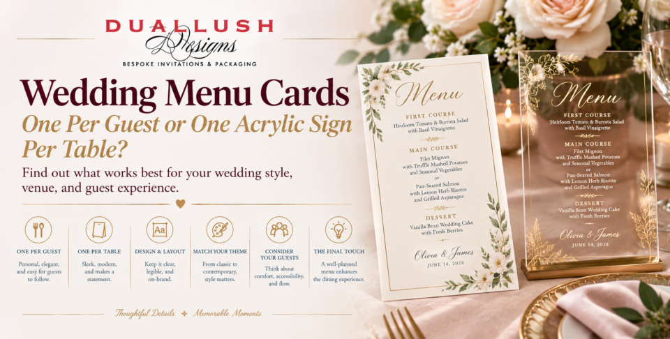
Once your reception menu is set, one quiet question remains: how will guests actually see what’s being served? Traditional wedding menu cards put a printed card at every place setting. A single acrylic menu sign on each table is the modern alternative. Both can look beautiful, but they affect your budget, your table styling, and the way guests experience dinner.
Here’s how to choose.
Choose a wedding menu card for every guest when dinner is formal, plated, and multi-course, or when guests pick between entrées. Choose one acrylic menu sign per table when the meal is simpler, family-style, or buffet-based, or when you want a design statement with far fewer pieces. Plenty of couples blend the two, which we cover below.
When One Menu Card Per Guest Makes Sense
Individual menus are the classic choice for a reason:
- Everyone can read at their own pace. Nobody has to lean around a centerpiece or wait for a neighbor to finish looking.
- They suit choices and dietary notes. If guests select an entrée or you want to flag vegetarian or gluten-free dishes, a personal card keeps that information close. Confirm any allergen labeling with your caterer before printing.
- They become keepsakes. Guests often take menus home, especially when the design matches the rest of the wedding.
- They fit a formal table. A menu resting on or beside the plate adds to a layered, black-tie look.
The trade-offs are quantity and logistics. Every guest means one more piece to produce, proof, and place. Order a few extras to cover late RSVPs and typos. If you like this route, browse Duallush’s custom wedding dinner menu cards, which come in acrylic, foil-printed, laser-cut, and kraft styles.
When One Acrylic Sign Per Table Works Better
A table-level menu sign treats the menu as part of the décor rather than as a handout.
- Far fewer pieces. Ten tables means ten signs instead of a hundred or more cards.
- It becomes a styling element. Acrylic catches candlelight and photographs well, so it sits comfortably next to florals, table numbers, and glassware.
- It suits a shorter menu. A sign works best when the content is a simple course list, with no per-guest choices to track.
- It’s built to last. Acrylic is sturdy and scratch-resistant, so it holds up through setup, service, and teardown.
The downside is shared viewing. Guests across the table read at an angle, and glare from reception lighting can make a poorly designed sign harder to read. Choose high-contrast lettering such as white ink or foil, and see our guide to your overall design style by exploring acrylic wedding invitations to coordinate materials across your stationery.
A Quick Look at the Numbers
Say you’re hosting 120 guests at 10 tables of 12. Individual menus mean 120 pieces. Table signs mean 10. That gap matters in two ways:
- Budget flexibility. With fewer pieces, you can often afford a more elaborate finish, such as foil or laser-cut detailing, without stretching the stationery budget.
- Setup time. Ten signs are placed in minutes. A hundred and twenty cards require careful, seat-by-seat placement, often alongside place cards.
Also consider table space. As a general guideline, a sign somewhere between 5 x 7 and 8 x 10 inches tends to sit well alongside a centerpiece, candles, and a table number. Larger tables or low arrangements can handle more; crowded rounds may not.
Readability Tips for Either Format
- Keep it scannable. List courses and main dish names rather than every ingredient.
- Limit your fonts. One display font for the heading and one clean font for the dishes is plenty.
- Think about lighting. Receptions are often dim, so prioritize contrast over delicate, thin lettering.
- Proof it twice. Check dish names, spelling, and order of courses with your caterer before approving.
A Middle Path: Combine the Two
You don’t have to choose just one format. Popular hybrids include:
- Signs for guest tables, cards for the head table. Give the wedding party and parents individual menus while everyone else shares a sign.
- A menu that doubles as a place card. Add each guest’s name, and the menu does two jobs, saving a piece on the table.
- A sign at the buffet or dessert station. Use a larger acrylic menu where guests actually make choices, and skip table-level menus entirely.
Whatever you pick, carry the look through from your wedding invitations. Repeating the same palette, lettering style, or monogram makes the reception feel like a continuation of the invitation your guests received months earlier.
Which Should You Choose?
- Formal, plated, multi-course dinner: individual menu cards.
- Entrée choices or dietary notes by guest: individual menu cards.
- Buffet, stations, or family-style service: one acrylic sign per table, or one at each station.
- Large guest count with a tight stationery budget: table signs.
- Design-forward, minimalist styling: table signs.
- Can’t decide: a hybrid, with signs on guest tables and cards at the head table.
The Bottom Line
Neither option is better in every case. Individual wedding menu cards give guests a personal, keepsake-worthy detail, while an acrylic sign per table delivers impact with fewer pieces. Let your service style, guest count, and table layout decide.
If you’re still weighing materials, order a sample from Duallush to see the finish and ink contrast in person, or reach out for a free design consultation to build a menu that matches your invitation suite.