You’ve probably seen plenty of crisp white wedding invitations. They’re timeless, yes. But if you’re going luxe and want your invitation to make a statement, it’s time to think beyond white. In 2026, color is doing more than “match the wedding.” It’s telling a story. It’s setting a mood. It’s a texture, a subtle emotion, and a visual invite to preview your big day.
Here are the eight color trends dominating luxury wedding stationery in 2026, along with tips on how to incorporate each one to make your invitation truly unforgettable.
1. Sage, Olive & Muted Greens
Soft, grounded greens are stepping into the spotlight. Think sage, olive, and eucalyptus tones rather than bright emerald. These shades exude a calm, elegant, and effortlessly upscale feel.
Why you’ll love it:
- Works across various seasons and venues, including indoor, outdoor, and garden settings.
- Pairs beautifully with metallics (such as gold and bronze) or creams.
- Feels modern yet still timeless. Less “trend”, more “classic in disguise.”
How to use it: Consider an invitation with an olive cardstock base and foil-stamped details in gold. Or have a vellum wrap with a sage leaf motif. The green should feel like a whisper of nature, not a shout.
2. Terracotta, Burnt Orange & Sunset Peach
Warm, rich, and a little earthy — these tones bring depth. Terracotta, burnt orange, and sunset peach are perfect for couples who want their invites to feel luxurious, tactile, and full of character.
Why you’ll love it:
- Evokes warm sunlight, clay, old-world textures.
- Great for autumn weddings but equally striking in summer or destination venues.
- Offers a bold alternative to blush pink or plain neutrals.
How to use it: A burnt orange envelope liner with a cream invitation card inside. Or a terracotta box with copper foil printing. Pair with greenery or brass accents for full effect.
3. Dusty Blue, Cornflower & Silver Mist
Cool tones get a textured upgrade in 2026. Dusty blues and silver-mist tones give invitations a refined calmness. These wedding color palettes are airy, chic, and elegant.
Why you’ll love it:
- Gives a fresh, modern feel without being cold.
- Perfect for spring, early summer, or evening weddings.
- Pairs well with white, cream, silver, or even navy for contrast.
How to use it: Use a dusty blue matte cardstock with silver foil for lettering. Or pick a silver-mist envelope with a subtle blue inner liner. The key is subtlety in the tone.
4. Butter Yellow, Lilac & Rosewater
Pastels are back, but smarter and more sophisticated. Think butter yellow, lilac haze, and rosewater pink. They are still soft, but with an elevated sensitivity.
Why you’ll love it:
- Gentle and romantic with an upscale finish.
- Ideal for gardens or outdoor weddings, especially those in the spring.
- Adds personality without overwhelming your overall theme.
How to use it: A butter-yellow envelope with a cream card inside, or a lilac insert tucked into a linen-textured box. Use fine foil or embossing so the result feels luxe, not casual.
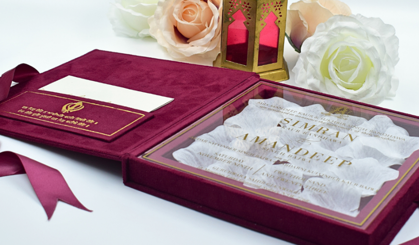
5. Dusty Mauve, Burgundy & Smoky Plum
For couples who love drama, depth, and sophistication, rich jewel tones are making a big comeback. Dusty mauve, burgundy, and smoky plum are luxe, moody, and beautiful.
Why you’ll love it:
- Adds richness and elegance to the invite suite.
- Great contrast with metallics like gold or copper.
- Works especially well for evening or winter weddings.
How to use it: A plum cardstock base with rose-gold foil. Or a dusty mauve invitation in a velvet box with burgundy ribbon. Depth of color equals a luxury feel.
6. Chocolate Brown & Warm Neutrals
Neutrals are getting a glow-up. Think almond, sand, oatmeal, and even chocolate brown. They add more warmth, more texture, and more personality than plain white.
Why you’ll love it:
- Understated luxury with subtle mood.
- Excellent for minimalist, rustic-elegant, or modern weddings.
- Base color that allows other elements (fonts, foil, texture) to shine.
How to use it: A sand-colored invitation card with letterpress printing. Or a chocolate brown envelope paired with cream card and copper foil. Texture is key here.
7. Cobalt Blue & Fresh Lime
For weddings that want bold and energetic, 2026 brings forward cobalt blue and fresh lime green-yellow. They are statement makers, but used thoughtfully, they feel fresh and premium.
Why you’ll love it:
- Instant impact.
- Brings modern flair and personality.
- Ideal for destination weddings or couples with a strong sense of style.
How to use it: Pair a cobalt blue envelope liner or wax seal with crisp white card. Or a fresh lime accent (ribbon or border) on neutral card stock. One bold color can elevate the entire suite.
8. Interior-Design Inspired Hues & Old-World Opulence
Luxury wedding stationery in 2026 is borrowing from fine art and high-end interior design. Moodier, richer hues; olive, deep blue, blackberry, and aged gold finishes. It is opulent without being flashy.
Why you’ll love it:
- Ideal if your wedding aesthetic is upscale, formal or heritage-inspired.
- These tones photograph beautifully, especially in evening light.
- Works across stationery, décor, linens, and invites for cohesive design.
How to use it: A jewel-tone invitation card (emerald, blackberry) with gold foil and a dark envelope. Or pair an interior design-inspired palette with textured paper and metallic print to create a tactile, luxurious feel.
How to Pick the Right Color for Your Invitation
Here are some quick tips to choose the color for your luxury wedding invitation card with confidence:
- Consider your wedding venue’s existing tones (walls, furnishings, and natural elements) and let your invitation reflect them.
- Consider lighting and season. Is your wedding an outdoor summer wedding? Choose lighter tones. For indoor evening affairs, deeper richness will work the best.
- Request material swatches so you can see how color and texture work together in real life.
- Remember: one hero color, paired with supporting neutrals, often works better than multiple competing tones.
Final Word — Make Your Invitation Feel 2026-Ready with Duallush
If you want your wedding invitation cards to reflect the freshest, most elevated trends of 2026, turn to Duallush. They offer premium materials, expert design support, and the freedom to choose from bold, on-trend colors or timeless, chic neutrals.
Your invitation is more than paper. It’s the first touchpoint of your celebration. Let it tap into the latest luxury color trends, show your personality, and make a statement that introduces your wedding day with style.
With Duallush, you’re not just choosing an invite… you’re crafting a memory… basically, your love story.