Your wedding invitation is the first peek your guests get into your big day. It is not just a piece of paper with details; it is a mood board in an envelope. The texture, color, and design give your guests a subtle hint of what awaits them when they arrive at your venue.
However, this is where most couples often stumble. They pick a design they love online, without considering how it connects to the space they are celebrating in. A beach wedding with a heavy royal velvet invitation? Confusing. A palace wedding with minimal white acrylic invites? Too modern for the mood. This mismatch highlights why selecting a wedding invitation card design that complements your wedding venue is not a matter of chance. It’s crucial.
Your wedding venue and your invitation should speak the same language. When they do, everything feels seamless. Here is how to ensure your wedding invitation perfectly matches your venue in spirit, in style, and in story.
Step One — Understand the Vibe of Your Venue
Every venue has a personality. It could be grand, rustic, coastal, vintage, or contemporary. Begin by looking closely at what makes your venue unique. Is it the architecture? The natural surroundings? The lighting or the color tones? The more you understand its vibe, the easier it becomes to translate that into your invitation design.
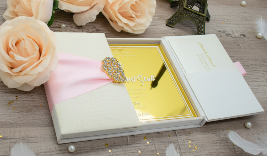
If your wedding is in a palace, consider textures that evoke a sense of royalty. The luxury wedding materials, like velvet with gold foil and embossed patterns, are your go-to options. If you are celebrating in a modern hall with glass walls and clean lines, go for sleek materials like acrylic or matte cardstock. For an outdoor garden venue, handmade or linen paper brings out that organic, nature-inspired charm.
The key idea: Your card should feel like it belongs at your venue before anyone even steps foot there.
Step Two — Use Color as Your Connector
Color is the simplest and most powerful way to tie your invitation to your venue. Look at the dominant shades of your space. Does greenery surround it? Think soft pastels or earthy neutrals. Does your venue have gold chandeliers or marble floors? Metallic accents will perfectly mirror that luxury.
If your wedding is by the sea, lean into dusty blues, sandy beige, and white with pearl or shimmer detailing. For city rooftops, monochrome with hints of bold metallics can feel striking and sophisticated.
Your wedding invitation color palette sets the mood, so ensure it reflects what your guests will experience when they arrive.
Step Three — Reflect Your Venue’s Texture and Tone
Luxury wedding invitations are all about touch. The way your card feels in your hand can tell your guests a lot about your event.
A rustic barn or vineyard wedding pairs beautifully with handmade paper, cotton cardstock, or kraft tones. For a palace or heritage venue, opt for rich textures, such as velvet, silk, or metallic finishes. Is your wedding venue a modern hotel or an urban loft? Just go for smooth, minimalist textures, such as matte acrylic or linen paper.
Your venue’s texture is part of its story. Matching your card to that feel creates harmony between the invitation and the celebration itself.
Step Four — Add Venue-Inspired Design Elements
Sometimes, it is the little visual details that tie everything together.
If your venue features ornate doors, chandeliers, or distinctive architectural details, incorporate them into your card through line art or embossing. A floral garden venue can inspire delicate watercolor flowers or pressed botanical motifs. A mountain venue can feature subtle topographic patterns or soft gradients.
This does not mean turning your wedding invitation card into a sketch of your venue. It is about adding design cues that make your guests go, “Oh, this feels like them.”
A few thoughtful details go a long way in making your invitation feel intentional and deeply personal.
Step Five — Match the Level of Formality
Every wedding venue has a distinct level of formality. Matching your invitation to that helps set expectations for your guests.
If you are getting married in a grand ballroom or palace, your invitation should convey a sense of polish and refinement. Think foiled lettering, layered cards, and statement packaging.
For a relaxed destination wedding or an intimate backyard setup, opt for a light, breezy, and warm design. Handmade textures, minimal typography, and natural colors create a welcoming tone.
Guests read more than just the words on your invitation. They sense the mood. Ensure that the mood aligns with what you are planning to create.
Step Six — Don’t Forget About Season and Lighting
This one is often missed, but it makes a big difference.
If your wedding is taking place in the summer, consider using lighter colors and breathable materials, such as cotton or linen, which feel fresh and inviting. For winter weddings, rich hues and tactile materials such as velvet or metallic finishes feel warmer and more festive.
Additionally, consider how the lighting at your venue interacts with the colors you’ve chosen. Gold or copper foil looks magical under warm candlelight, while silver and cool tones shine under bright or natural light.
Your invitation should match not just the place but also the time and season of your celebration.
Step Seven — Make It Feel Like You
The best luxury wedding invitations are not just about matching a venue; they are about reflecting your love story through your invitation card. Your venue might be the stage, but you and your partner are the story unfolding on it.
Whether you are designing something royal, minimalist, or rustic, let your personality shine through. Add a custom monogram, a quote that holds meaning for you, or a color that ties back to your outfits.
Luxury is not about excess. It is about intention. The right invitation feels both authentic and elevated, like a perfect reflection of your love, your style, and your chosen setting.
The Golden Rule — Your Card and Your Venue Should Tell the Same Story
When your guests open your invitation, they should be able to picture the place where they will celebrate with you. The materials, colors, and finishes should give them a sense of what to expect, from the energy of the décor to the overall atmosphere.
Think of your venue and your invitation as two chapters of the same story. The venue is where it all happens. The invitation is the prologue that sets the mood. When both align, everything feels more intentional and immersive.
Take a moment to visualize the full experience — how your invitation feels in your hand, how it complements the setting, and how it flows into the story you are creating for your big day.
When all these details connect, your guests will not just admire your invitation. They will feel it.
Bring It All Together with Duallush
If you want your luxury wedding invitations and your wedding venue to speak the same language, Duallush makes it effortless.
Duallush is an online platform for ordering online wedding invitation cards, designed for couples who care about detail, quality, and personalization. You can explore an entire collection of Duallush designs, featuring premium materials ranging from velvet to acrylic and handmade paper, and customize everything from the font to the foil finish.
Their team understands that every venue tells a story, and every card should match that story perfectly. Whether you are hosting your wedding at a palace, by the beach, or in your own backyard, Duallush helps you design invitations that capture your setting and your spirit.
Your venue deserves an invitation that feels like it was made for it. With Duallush, you can create one that looks stunning, feels luxurious, and tells your story exactly the way it should be told.
FAQ Frequent Asked Questions
1. How do I choose wedding invitations that match my venue?
Choose invitations based on your venue’s style, architecture, color palette, and ambiance. Align textures, colors, and materials with the venue’s overall mood.
2. Should my wedding invitation match my wedding venue?
Yes. Matching your invitation to your venue creates a cohesive experience and prepares guests for the style and formality of your big day.
3. What colors should I choose for my wedding invitations based on my venue?
Select colors that reflect your venue’s tones—pastels for gardens, metallics for ballrooms, beach shades for coastal venues, and neutrals for modern spaces.
4. What materials work best for luxury wedding invitations?
Top materials include velvet, acrylic, handmade paper, metallic cardstock, and linen paper. Choose based on your venue’s vibe.
5. Which wedding invitation style works for a palace or ballroom venue?
Choose rich materials like velvet, gold foil, embossed details, or boxed invitations that reflect the venue’s grandeur and formality.
6. What invitation style is best for a garden or outdoor wedding?
Handmade paper, cotton textures, botanical artwork, and pastel tones complement the natural, organic atmosphere of an outdoor venue.
7. How do I tie my wedding invitation design to the venue’s architecture?
Use subtle design cues—like line art, motifs, or patterns inspired by doors, arches, chandeliers, or floral elements found at the venue.
8. Should the season influence my wedding invitation design?
Absolutely. Choose lighter colors and airy materials for summer weddings, and rich textures like velvet or metallics for winter celebrations.
9. How formal should my wedding invitations be?
Match your invitation’s formality to the venue. Ballrooms require refined luxury, while beach or backyard venues call for relaxed, minimal designs.
10. How can I ensure my invitation truly reflects my wedding style?
Combine venue-inspired elements with personal touches—like monograms, custom illustrations, or meaningful colors—to make the design uniquely yours.