
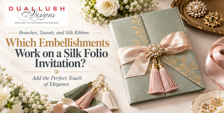
A silk folio invitation already does a lot on its own. The fabric has a soft sheen, the structure opens like a small book, and the pockets inside keep your suite organized. So what does an embellishment add?
Quite a lot, as it turns out. A brooch, a ribbon, or a tassel gives the folio a focal point, acts as a closure, and signals the style of the wedding before a guest has opened anything. But silk is also a material that’s easy to overload. The right embellishment makes the folio feel finished. The wrong combination makes it feel crowded.
Here’s how each option works on a silk folio, and how to choose.
First, Why Embellishments Matter on Silk
Silk is a quiet material. Its beauty comes from sheen and drape, not from bold color or heavy texture. That’s exactly why a single, well-chosen detail carries so much weight on it. A small point of sparkle or a band of contrasting ribbon gives the eye somewhere to land, and it frames the fabric instead of competing with it.
Embellishments also do practical work. A ribbon holds a folio closed during mailing and makes opening it a small ceremony. A brooch or buckle anchors the ribbon and adds a point of interest at the center of the cover. Together, they turn a flat piece of stationery into an object guests want to handle.
Brooches: The Signature Detail
On silk folios, the brooch is often the star. It’s the one element that adds sparkle, dimension, and a sense of jewellery to what is otherwise a soft, matte-sheen surface.
Pearl brooches. Pearls read as classic, soft, and timeless. A pearl brooch suits romantic, traditional, or coastal-leaning weddings, and it pairs well with ivory, white, champagne, and blush silk. On a richly textured fabric like brocade, a pearl detail adds quiet luxury without extra color. You can see this pairing on our brocade silk folio with a pearl brooch and gold ribbon.
Crystal rhinestone brooches. These bring more sparkle and a more formal, glamorous feel. They work especially well on deeper silk shades like royal blue, emerald, maroon, and silver, where the brilliance of the stones stands out against the fabric. A silver or filigree-style design adds a regal touch. Our white silk folio with a silver ribbon and crystal rhinestone brooch is a good example of how a sparkling brooch can give an all-white palette real presence.
Mixed pearl and crystal designs. Some brooches combine both, balancing softness and sparkle. These are a flexible middle path if you want glamour without going fully dazzling.
Choosing between them. Pearls lean romantic and soft. Crystals lean formal and festive. Match the brooch to the overall tone of your wedding, and consider your jewelry, your florals, and any metallics in your decor. If your palette includes gold, a warm-toned setting tends to blend better. If it includes silver or cool tones, a silver or clear-crystal setting usually looks cleaner.
Silk and Satin Ribbon: The Frame
Ribbon does more than tie things closed. It defines the folio’s visual structure, drawing a line across the cover that guides the eye toward the brooch or monogram.
Double-trim ribbon. A ribbon with two layers or two tones adds depth without adding another element. It’s a refined way to introduce a second color, such as a gold edge on a silver ribbon, without introducing a second detail.
Tone-on-tone ribbon. A ribbon close in color to the folio looks restrained and sophisticated, and it lets the brooch do the talking.
Contrasting ribbon. A ribbon in a different color creates a deliberate accent. White satin across royal blue silk, or silver across white, creates a crisp, graphic effect that photographs well.
Silk versus satin. Satin has a smooth, glossy finish that catches light, while silk ribbon has a softer, more organic drape. For a folio already wrapped in silk, satin ribbon often adds welcome contrast in texture, while silk ribbon creates a quieter, tonal look. Either can work. Choose based on whether you want contrast or harmony.
Width matters. A wide ribbon feels bold and ceremonial. A narrow one feels delicate and understated. Match the width to the scale of the folio and to the size of any brooch it carries.
Tassels: Handle With Care
Tassels are a popular embellishment on invitation boxes and larger formats, where their movement and weight are part of the effect. On a folio, they behave differently. A tassel adds drape and a traditional, ornamental feel, but it also adds bulk, and it can compete with a brooch for attention.
Here’s a good rule of thumb: choose a brooch or a tassel as your focal point, not both. A tassel works best when you want a softer, more textile-driven look, or when the ribbon itself becomes part of the design. If your folio already carries a statement brooch, adding a tassel usually tips the design from elegant to busy.
If you love the tassel look, discuss placement and scale with your stationer early, since the weight and length need to suit the folio’s size and the mailing method.
Monograms: A Personal Layer
A foil-stamped or embroidered monogram is a different kind of embellishment. Instead of adding sparkle, it adds identity. It pairs naturally with a ribbon, since the two can sit together without crowding each other, and it works well when you want a more minimal presentation without a brooch. Consider a monogram when personalization matters more than ornament.
How to Combine Embellishments Without Overloading
The most effective folios follow a simple discipline: one focal point, one supporting detail.
- One star. Choose a brooch, a tassel, or a monogram as the main feature.
- One supporting element. A ribbon, in the right width and color, completes the look.
- Everything else stays quiet. Let the silk and the foil-printed insert carry the rest.
A few combinations that tend to work well:
- Classic and romantic: ivory or white silk, tone-on-tone satin ribbon, and a pearl brooch
- Glamorous and formal: deep jewel-toned silk, contrasting satin ribbon, and a crystal rhinestone brooch
- Minimal and modern: neutral silk, a slim ribbon, and a monogram in place of a brooch
Match the Embellishment to the Wedding
- Formal, evening, or black-tie: crystal brooches and contrasting ribbon feel appropriately ceremonial.
- Romantic, garden, or coastal: pearls and soft, tonal ribbon feel airy and gentle.
- Cultural and multi-day celebrations: richer silks, gold accents, and ornate brooches echo the textile traditions often central to these weddings.
- Modern and minimal: restrained ribbon and monogram keep the look clean.
Practical Checks Before You Order
- Weight and postage. Brooches and tassels add weight, so weigh a finished sample before buying stamps.
- Packaging. Protective outer packaging keeps embellishments secure and the silk smooth in transit.
- Color accuracy. Silk, ribbon, and brooch finishes can read differently in person than on a screen, so ordering a sample is the surest way to judge the combination.
- Pocket capacity. If you plan to add RSVP, details, or accommodations cards, confirm the folio’s pockets can hold them comfortably.
The Bottom Line
On a silk folio, restraint is the real luxury. Choose one focal point, support it with the right ribbon, and let the fabric and foil-printed insert do the rest. Whether you reach for the softness of pearls, the brilliance of crystal, or the simplicity of a monogram, the best embellishment is the one that makes the folio feel like it belongs to your wedding.
Browse our silk folio invitations or get a free design consultation with our team, and we’ll help you choose the combination of silk, ribbon, and embellishment that suits your celebration.