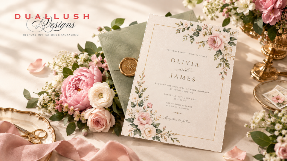
A floral wedding invitation should feel like a preview, not a guess. When the flowers printed, painted, or embossed on your invitation actually echo what’s waiting at your ceremony and reception, guests arrive with an accurate feeling for your day before they’ve seen a single centerpiece. When they don’t match, the invitation just becomes generic decoration. Here’s how to make sure yours does the former.
Start With Your Actual Florals, Not a Generic Template
The most common mistake in floral invitation design is choosing a pretty illustration first and figuring out real wedding flowers later. Work backward instead: settle on your actual bouquet and centerpiece flowers or at least your florist’s general direction before finalizing your invitation’s botanical illustration. If your reception will feature garden roses, ranunculus, and lisianthus in soft tone-on-tone neutrals, an invitation covered in bold tropical blooms will feel disconnected the moment guests arrive and see the real thing.
Match Illustration Style to Your Overall Floral Aesthetic
2026’s wedding florals are trending in a few distinct directions, and your invitation’s botanical style should follow whichever one your actual wedding is leaning toward.
Sculptural and architectural. If your florals lean toward asymmetrical, editorial arrangements with intentional negative space rather than traditional round bouquets, your invitation should echo that restraint. A single, impactful bloom one architectural calla lily, one bold anthurium rendered in blind embossing or white-on-white printing communicates the same sculptural sophistication without needing a busy floral border.
Monofloral and monochromatic. Many 2026 couples are choosing a single flower type or a tone-on-tone palette an all-blush bouquet ranging from soft petal pink to deep rose, for example over mixed arrangements. An invitation illustration built around that same single bloom, rather than a generic mixed-flower motif, reinforces the cohesive, editorial feel this style is going for.
Meadow and garden-style. Loose, wildflower-inspired arrangements with delicate stems of varying heights call for a softer illustration approach watercolor washes, pressed-flower textures, or a looser, hand-drawn linework style rather than crisp, structured botanical drawings.
Immersive and jewel-toned. For weddings building bold, deep-colored floral moments burgundy, plum, and navy florals paired with warm neutrals invitations benefit from richer color treatments and materials that can hold that same depth. This is exactly where velvet invitations come in: the fabric’s saturated color range mirrors jewel-toned floral palettes far more convincingly than flat printed paper can.
Techniques That Bring Florals to Life on Paper
Blind embossing. For sculptural, minimalist floral styles, a raised, uninked floral impression adds dimension and texture without competing with the rest of the design subtle enough to reward a closer look rather than dominating the card.
Vellum overlays. A translucent vellum layer placed over a floral illustration or watercolor venue sketch creates a soft, gentle reveal almost like lifting a small veil before the full design underneath is visible. It works particularly well for garden and meadow-style weddings, softening the botanical illustration underneath into something dreamier than a flat printed version would achieve.
Foil-stamped botanicals. A single-color foil floral motif, kept intentionally simple, adds shine and dimension while staying aligned with 2026’s broader preference for restraint over dense, fully illustrated florals.
Watercolor and hand-painted illustration. Best suited to romantic, garden, or destination weddings, watercolor florals bring warmth and softness that structured line art doesn’t, and they pair especially well with a custom venue illustration if you’re incorporating one into your suite.
Matching Materials to Your Floral Palette
Beyond the illustration itself, the base material of your invitation should support the floral color story rather than compete with it.
- Deep, jewel-toned florals (burgundy, plum, forest green) pair beautifully with velvet, since the fabric’s depth of color amplifies those same rich tones.
- Soft neutral and tone-on-tone florals (ivory, blush, cream) suit heavier cotton cardstock or a silk folio presentation, letting the understated palette read as elegant rather than flat.
- Bold, sculptural, or monofloral arrangements with a modern edge pair naturally with acrylic invitations, where a single botanical silhouette laser-cut or printed on a clear or frosted panel echoes the same architectural restraint as the floral design itself.
Seasonal Considerations
Florals are inherently seasonal, and your invitation’s botanical choices should acknowledge that rather than picking flowers that won’t actually be in bloom for your date. Spring weddings lean into tulips, pansies, and bright citrus-inspired tones; summer favors meadow blooms and fruit-and-flower pairings; fall and winter suit richer, jewel-toned botanicals that echo the deeper color palettes already common in cooler-season weddings. Choosing an invitation illustration that matches your actual season avoids an easy-to-spot mismatch between your stationery and your real event.
A Few Practical Tips
- Share your florist’s mood board with your stationer. The closer your invitation designer can align color and bloom choice to your actual floral plan, the more cohesive the final result will feel.
- Don’t over-illustrate if your real florals are minimal. A sculptural, restrained floral event calls for a restrained invitation – resist the urge to add a full floral border just because it’s available as an option.
- Order a sample before committing, especially if you’re pairing florals with a colored or textured material like velvet. Ordering a sample lets you see how the floral illustration and material color actually interact in person, rather than guessing from a screen.
The Bottom Line
A floral wedding invitation works best when it’s treated as the first chapter of your actual wedding story, not a decorative flourish chosen independently of it. Match your illustration style, color palette, and material to the real flowers waiting at your venue, and your invitation will do exactly what it’s supposed to: give guests an accurate, beautiful preview of the day ahead.
Want help translating your floral vision into your invitation suite?
Get a free design consultation with our team, and we’ll help you match your blooms, palette, and materials into one cohesive design.