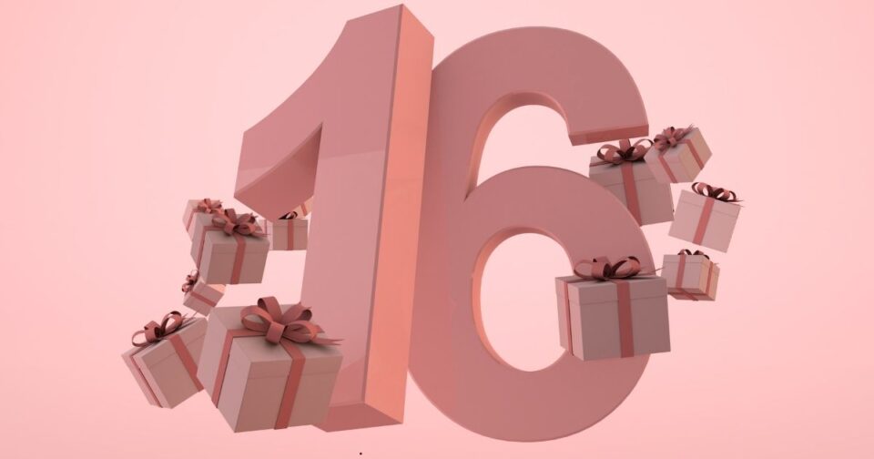
Sweet 16 parties start with the perfect invitation. As invitation makers, we see how these small pieces of paper or digital designs create big excitement for the upcoming celebration. Your invitation is more than just party details – it’s the first peek into your party’s style and mood. Think of it as a movie trailer that gets everyone excited about what’s coming.
We’ve helped thousands of families create invitations that match their party themes perfectly. The right colors, fonts, pictures, and even the paper type all work together to tell your guests what kind of amazing party they’ll be attending. When we make invitations, we focus on five main things: the colors that match your theme, fonts that fit the mood, graphics that catch the eye, words that sound just right, and paper that feels special.
Many parents tell us they’re surprised by how much an invitation’s design affects their guests’ reactions. A Hollywood-themed party invitation with gold foil and star designs gets very different responses than a tropical paradise invitation with bright colors and palm trees. That’s why we put so much thought into matching every part of the invitation to your theme.
We’ve written this guide to show you all the ways we can make your Sweet 16 invitations special. Whether you want something classic and elegant or fun and creative, we’ll cover everything you need to know about choosing the right design elements for your theme.
Core Design Elements for Any Theme
Before we jump into specific themes, let’s talk about the building blocks of great invitation design. Colors are super important – they set the mood right away. For fancy parties, we often use deep purples and golds. Beach themes look great with blues and corals. The colors you pick will show up everywhere – in the text, borders, and backgrounds.
Fonts are just as important as colors. Big, swooping letters look romantic and fancy. Clean, simple fonts look modern. We always make sure the fonts are easy to read – nothing’s worse than squinting at party details! Some of our clients mix two or three fonts to create different looks for the birthday girl’s name and party information.
The paper you choose matters too. We offer lots of options: shiny metallic paper for glamorous themes, textured paper that feels like sand for beach parties, or smooth matte paper for a classic look. Some clients love adding special touches like glitter, ribbons, or even tiny seashells.
We’ve noticed that more people want both printed and digital invitations now. Digital ones are great for sending quick updates or linking to party websites. But most families still want physical invitations too – there’s something special about opening a beautiful invitation in the mail.
When we help clients pick these elements, we always think about how they’ll work together. A great invitation doesn’t just look good – it feels right for the party you’re planning.
Hollywood Glam Theme
Creating Hollywood-style invitations is one of our favorite projects. These invitations need to sparkle and shine from the moment guests see them. We start with black or deep red cardstock as the base – these colors instantly say “red carpet event.” Then we add metallic touches that catch the light. Gold foil printing for the birthday girl’s name makes it pop like a star on the Walk of Fame.
We often use star shapes and art deco patterns around the edges. These little details remind people of old Hollywood theaters and movie premieres. Many clients love our ticket-style invitations that look like VIP passes to a big movie opening. We can even add a small photo of the birthday girl styled like a movie star headshot.
The words we use are just as important as how the invitation looks. Instead of just saying “You’re invited,” we write things like “Join our Leading Lady” or “A Star-Studded Celebration.” Little changes like this get guests excited about dressing up and feeling like celebrities themselves.
For paper, we recommend our premium metallic cardstock. It has a subtle shimmer that looks amazing under any light. We can also add crystal embellishments or metal corner pieces for extra glamour. Some clients choose to put their invitations in silver envelopes lined with red paper – just like a Hollywood premiere invitation.
Masquerade Ball Theme
Masquerade invitations let us play with mystery and elegance. We love using deep jewel tones – think rich purples, deep blues, and emerald greens. The key feature is always the mask design. We can print these with special techniques that make them look three-dimensional, or even cut out actual mask shapes in the invitation.
Filigree patterns work really well for this theme. We print these in metallic ink or with raised embossing so guests can feel the pattern. It’s those little touches that make people want to keep their invitations as souvenirs. Many clients choose our layered invitation style – a sheer overlay with mask designs over the party details creates that perfect mysterious feel.
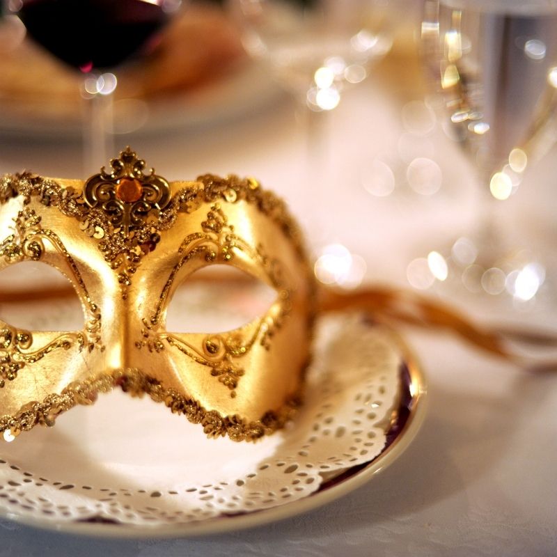
For paper, we recommend a heavy cardstock with a pearl finish. This gives the invitation an elegant sheen without being too flashy. We can add real lace, small feathers, or ribbons to match the masks guests might wear. Some clients even include a small masquerade mask charm with each invitation.
The wording for masquerade invitations needs to be both mysterious and clear. We might say “Join us behind the mask” or “A night of mystery awaits.” But we always make sure to mention if guests need to bring their own masks or if masks will be provided at the party.
Tropical Paradise Theme
Beach and tropical themes need bright, happy colors that make people think of summer fun. We use lots of bright corals, turquoise blues, and sunny yellows. Palm leaves and tropical flowers are must-have design elements. We can print these in watercolor style for a soft, dreamy look, or bold and bright for more pop.
Paper choice is super important for tropical themes. We offer textured paper that feels like sand, or natural-fiber papers that give an island vibe. Some clients love our “message in a bottle” invitations – we print on paper that looks like aged parchment and roll it into mini bottles. Others prefer passport-style booklets with tropical stamps and travel details.

We’ve had great success with sunset gradient backgrounds. The colors blend from yellow to orange to pink, just like a beach sunset. We can add small shells, tiny paper flowers, or even dried orchids as attachments. Some clients choose raffia ties instead of ribbons for a more natural look.
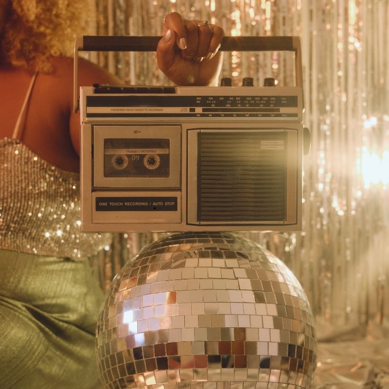
Digital Integration
Digital features make Sweet 16 invitations more fun and practical. We create custom QR codes that match your invitation design – no boring black squares here! When guests scan them, they can RSVP instantly and get updates about the party. For Hollywood themes, we make the QR codes look like mini movie tickets. For masquerade themes, we hide them in mask designs.
Our digital add-ons work with both printed and electronic invitations. We can make your e-vites sparkle and move on screen. Imagine golden stars that twinkle for Hollywood themes or masks that reveal party details for masquerade balls. For tropical themes, we add waves that move and palm trees that sway.
Social media is big for Sweet 16s now. We help create party hashtags that look good on the invitation and are easy to remember. Some clients love our custom Snapchat filters that match their invitation designs. These work great during the party when guests take lots of pictures.
Many families use our party websites that match their invitations. These sites let guests see all the party details, choose meal options, and even help plan surprises for the birthday girl. We make sure everything looks perfect on phones and computers.
Budget Considerations
Making beautiful invitations doesn’t mean breaking the bank. We offer smart ways to get the look you want without overspending. Simple changes like using metallic ink instead of real foil can save money while still looking amazing. Digital elements like QR codes and websites actually help save money on extra insert cards.
The key is knowing where to spend and where to save. Good paper quality matters – it’s the first thing guests feel. But you can skip expensive add-ons like crystal decorations and still have stunning invitations. We offer package deals that include both digital and printed invitations at better prices than buying them separately.
Ordering early helps too. Rush fees can eat up your budget fast. We offer discounts for orders placed two months or more before the party. Many clients save money by choosing simpler envelope designs and spending more on the invitation itself.
DIY assembly can also cut costs. We can print your invitations and provide materials like ribbons and decorations for you to attach. This works especially well for tropical themes where natural elements like dried flowers cost less when you buy them locally.
Timeline and Planning
Getting your invitations right takes time. Here’s what we’ve learned works best: Start planning three months before the party. This gives you time to look at samples, pick your perfect design, and make any changes needed. Order your invitations six to eight weeks before the party. This leaves plenty of time for printing, assembly, and mailing.
We handle the whole process step by step. First, we show you design options that match your theme. Once you pick a design, we create a digital proof for you to check. Many clients make small changes at this stage – it’s normal and we plan for it. After you approve the design, printing takes about two weeks.
For complicated designs like masquerade masks or message bottles, we recommend allowing extra assembly time. We can help stuff envelopes and add decorations, or send everything ready for you to assemble. Either way, plan to mail invitations four to six weeks before the party.
Common Mistakes to Avoid and Conclusion
We’ve seen what works and what doesn’t over years of making Sweet 16 invitations. The biggest mistake is cramming too much information onto the invitation. We help you figure out what details to include and what can go on your party website instead. Another common issue is picking fonts that look pretty but are hard to read. We’ll guide you to choices that are both beautiful and clear.
The bottom line is this: your Sweet 16 invitation sets the tone for the whole party. We know how to make that first impression count. Whether you want Hollywood glamour, masquerade mystery, or tropical fun, we’ll help create invitations that get your guests excited and make your Sweet 16 memorable from the very first moment.
Remember, it’s about creating something that feels right for you. We’re here to help turn your theme ideas into invitations that wow your guests and start your celebration off perfectly.